Fast read
Check the State of Charge to see how full your battery is. Use the energy flow diagram to see where power is coming from and where it is going. During the day, solar should power your home and charge the battery. At night, the battery should discharge to run your home. Grid imports occur only when solar and battery cannot meet demand.
What Is the State of Charge (SOC)?
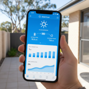
The State of Charge, often shown as SOC, is simply the fuel gauge for your battery. It is displayed as a percentage inside a battery icon. If it shows 100 percent, your battery is full. If it shows 10 percent, it is nearly empty.
This number tells you how much stored solar energy you have available to use when the sun is not shining. It is the quickest way to understand how much backup power or evening usage you currently have stored.
How Do I Read the Energy Flow Diagram?
The most important screen in your battery app is the live energy flow diagram. Whether you are using Sigenergy, Sungrow or Fronius, the concept is the same. The diagram shows four key components: your solar panels, your home, the battery and the grid.
During the day, you will see solar generation displayed in kilowatts. An arrow will show power flowing from the solar panels to your house. The number next to the house icon shows how much electricity your home is consuming at that moment.
If your solar production exceeds your home’s consumption, the excess energy flows into the battery and charges it. If the battery is already full, that extra energy flows to the grid, meaning you are exporting power and earning a feed-in tariff.
What Should I See at Night?
At night, solar generation drops to zero. The battery should then begin discharging to power your home. You will see energy flowing from the battery icon to the house icon. This means your home is running on stored solar energy instead of buying electricity from the grid.
You should only see significant energy flowing from the grid into your home when both conditions apply: there is no solar production and the battery has been depleted. That is when your system must import electricity from your retailer.

How Do Sigenergy, Sungrow and Fronius Differ?
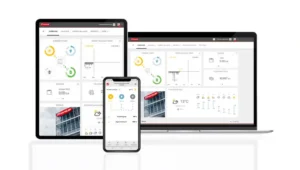
While the layout may vary slightly, the core data remains the same across brands. The Sungrow iSolarCloud app typically places the energy flow diagram on the main screen. The Fronius Solar.web app uses a clear circular diagram layout. The Sigenergy mySigen app prominently displays both the State of Charge and live energy flow on the dashboard.
All three platforms update data every few minutes rather than every second. If you turn on a large appliance, there may be a short delay before the numbers reflect the change. To see long-term performance and savings, you should review the daily, weekly and monthly history graphs, which show how much grid electricity you have avoided over time.